Rugby Players Association
Rugby Players Association
Rugby Players Association
Rugby Players Association
Rugby Players Association
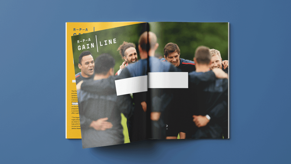
Founded in 1998, the Rugby Players Association represents more than 1,000 professional rugby players, both past and present. The RPA runs a variety of projects, but it was not always clear that they were connected to the association. The brand architecture was confusing and required rationalising, while the brand strategy and identity was dated and needed a refresh.
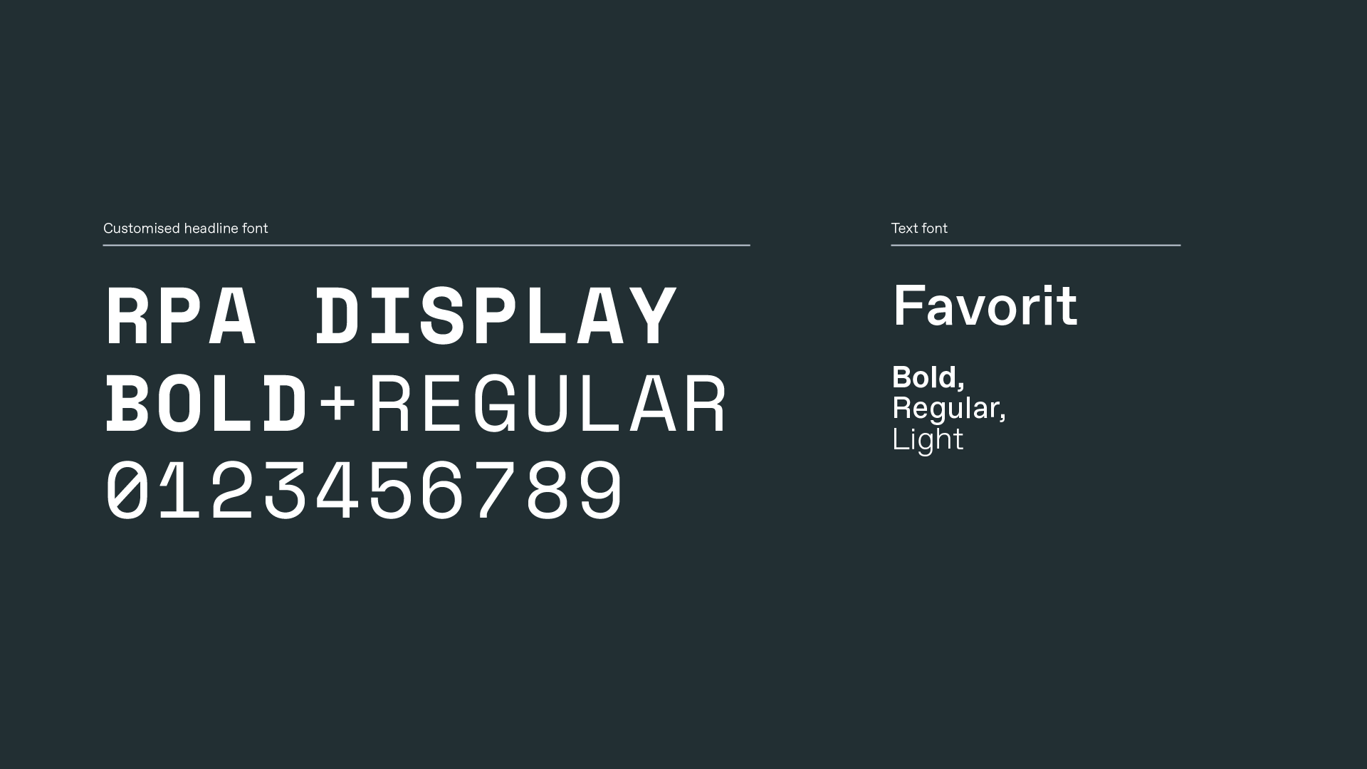
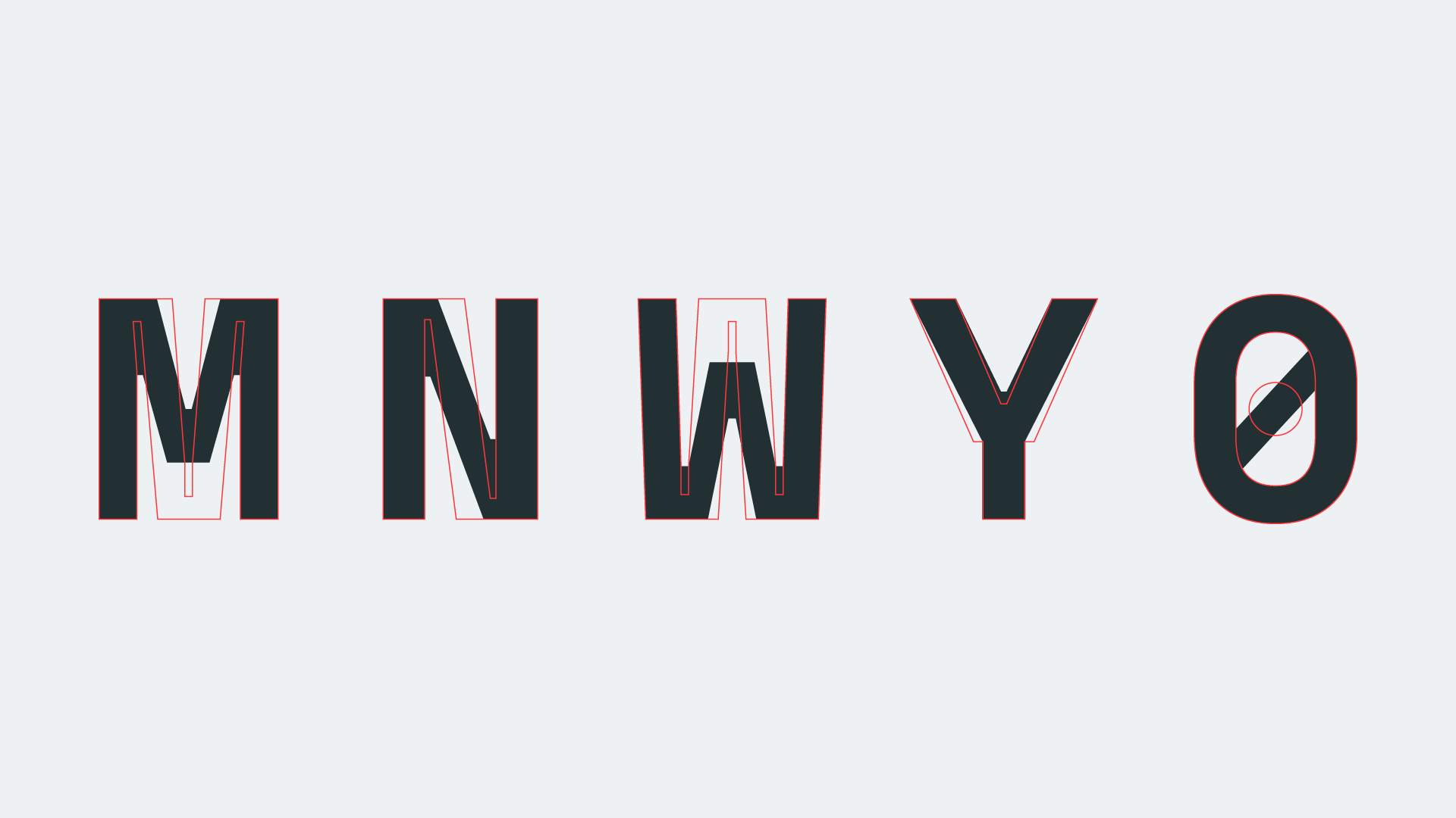
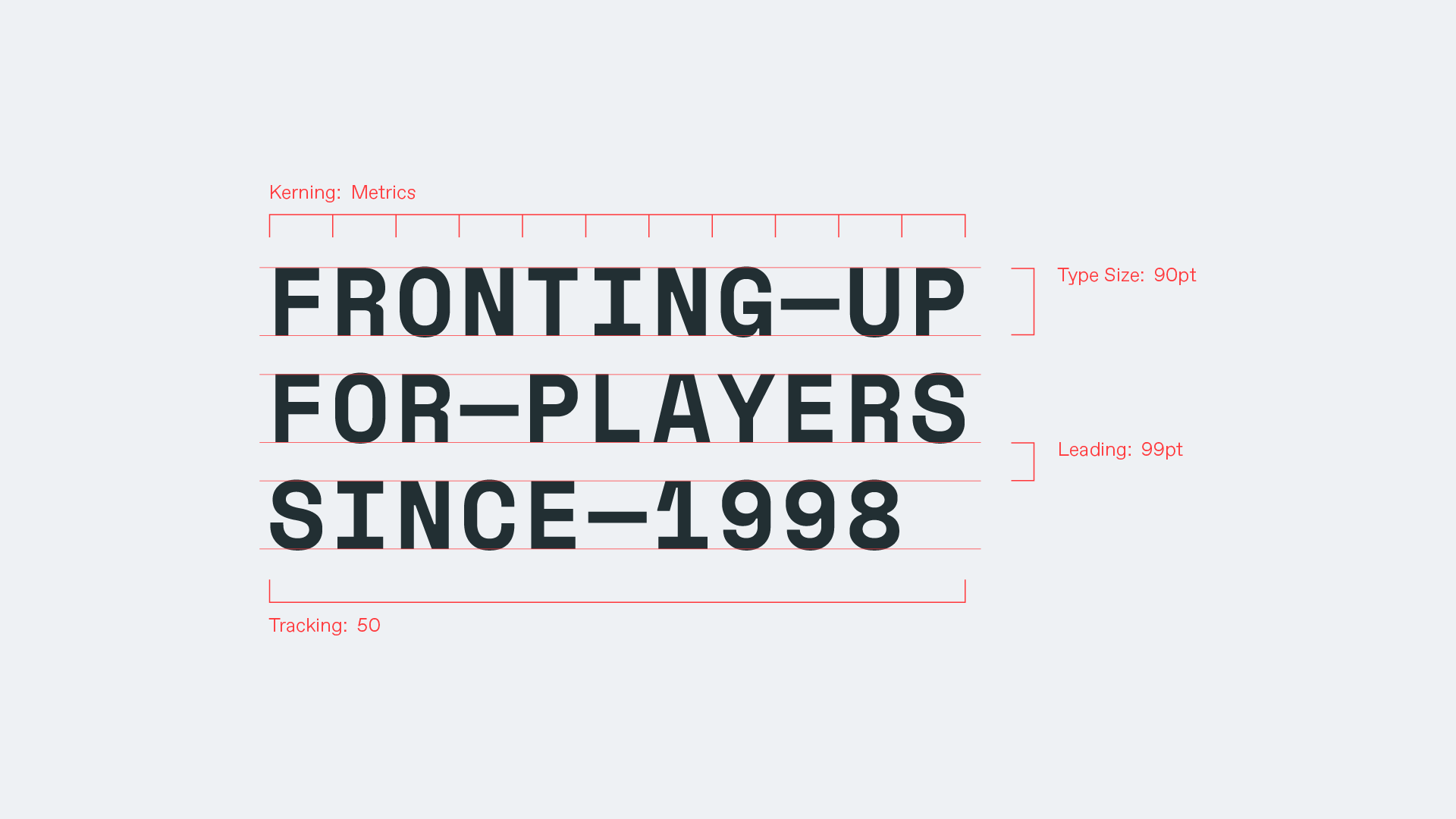
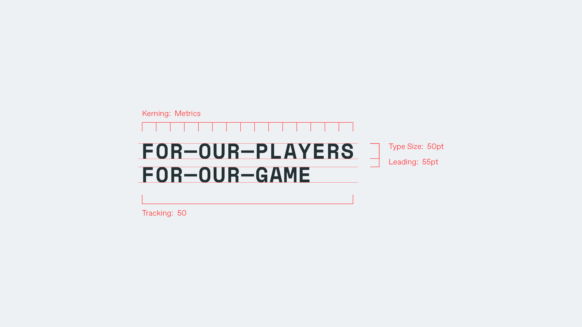
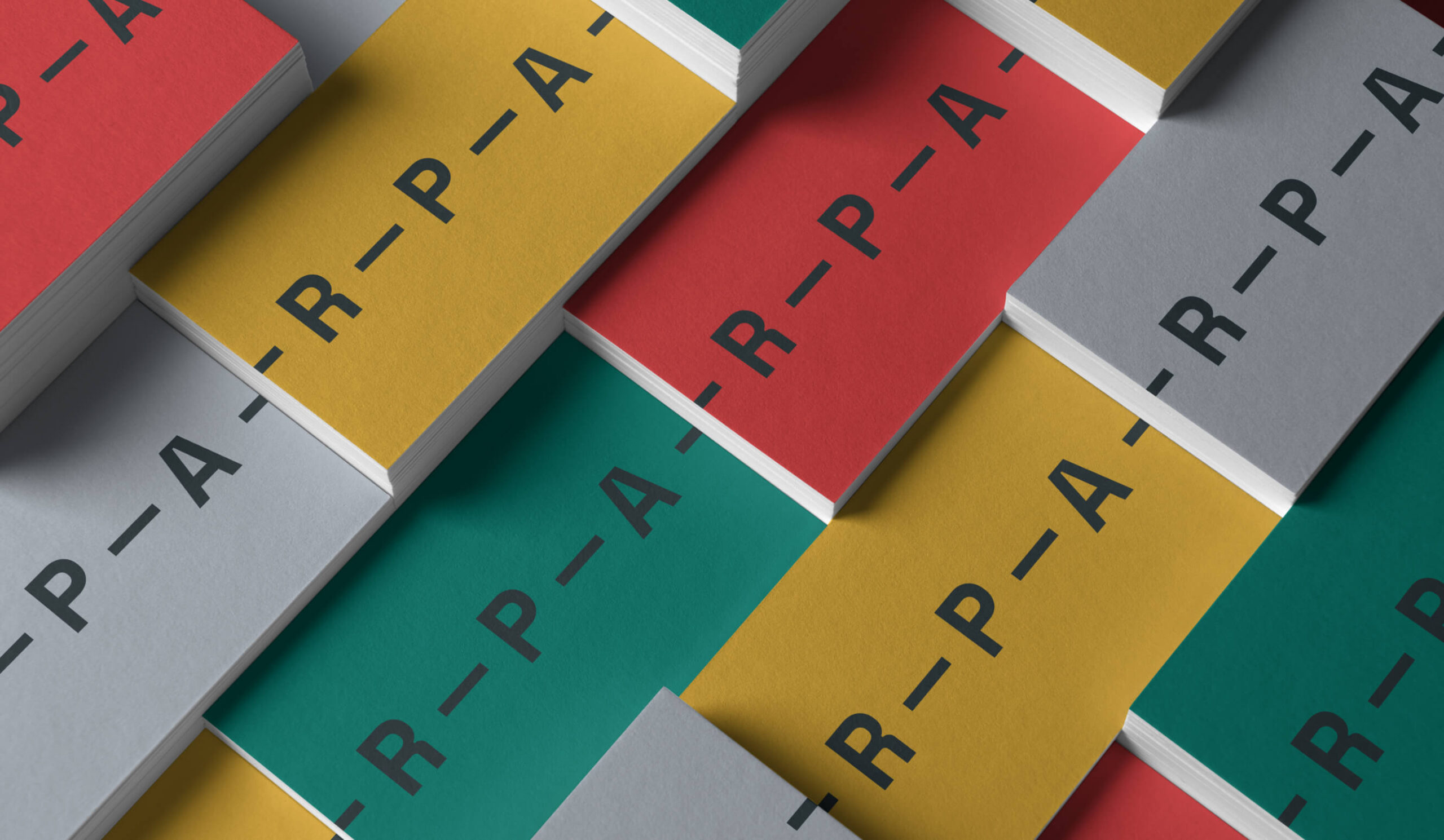
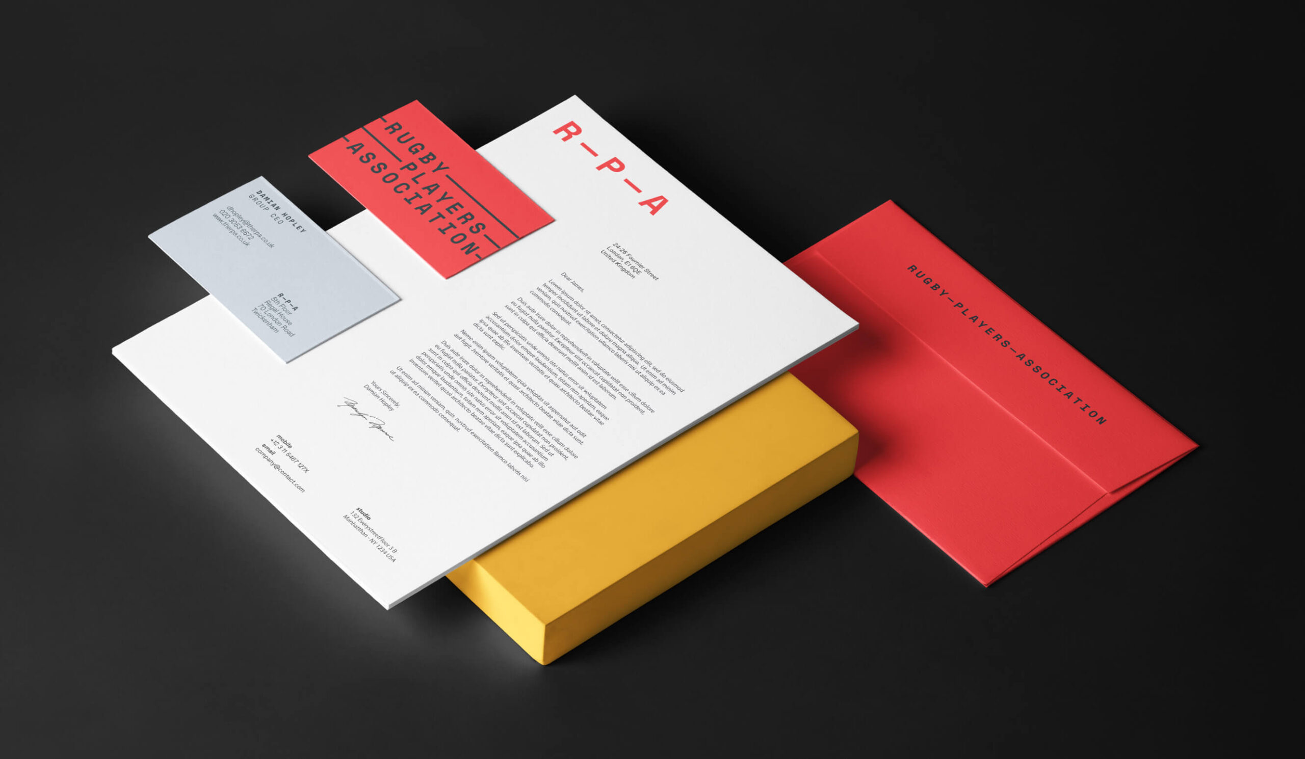
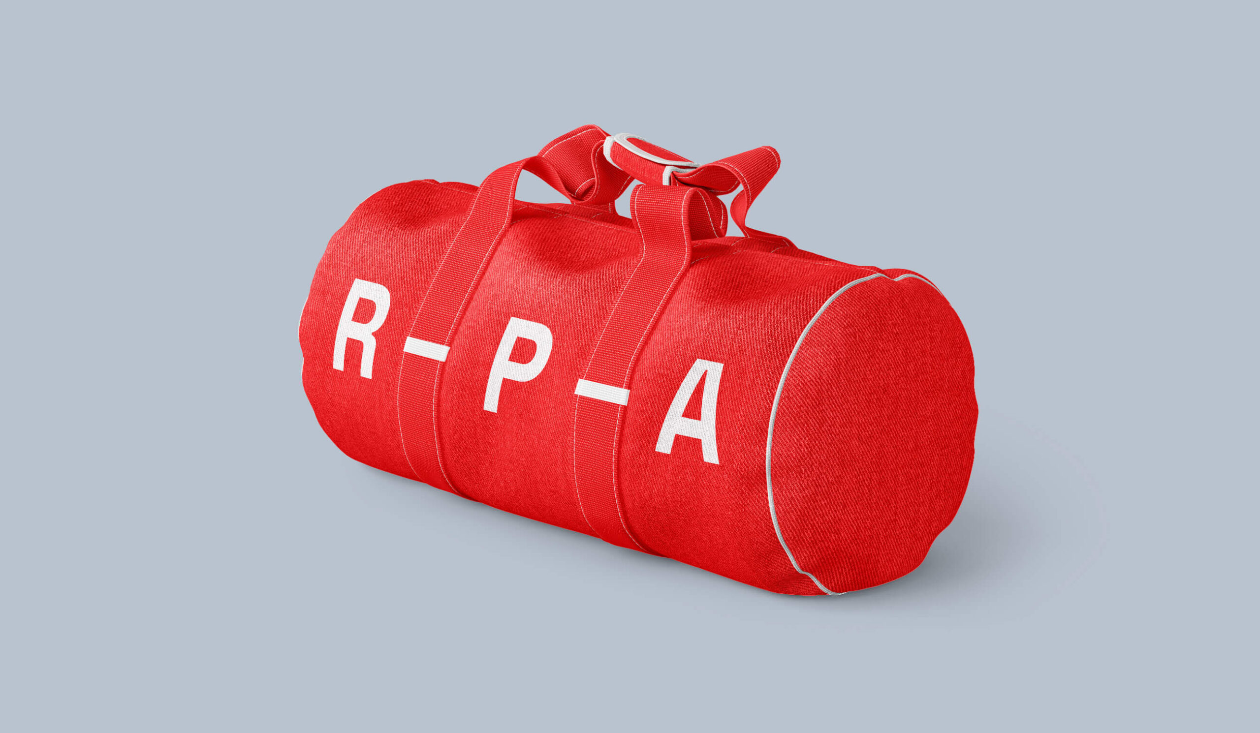
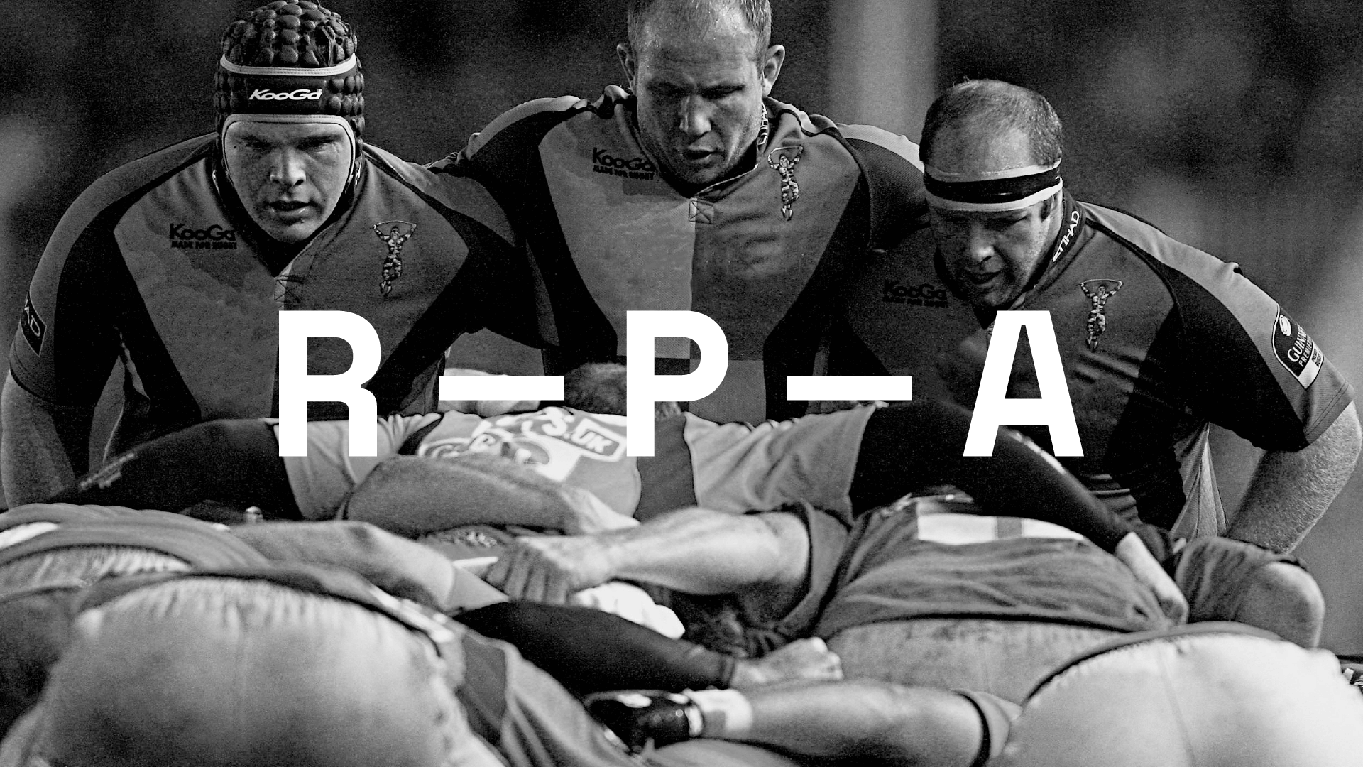
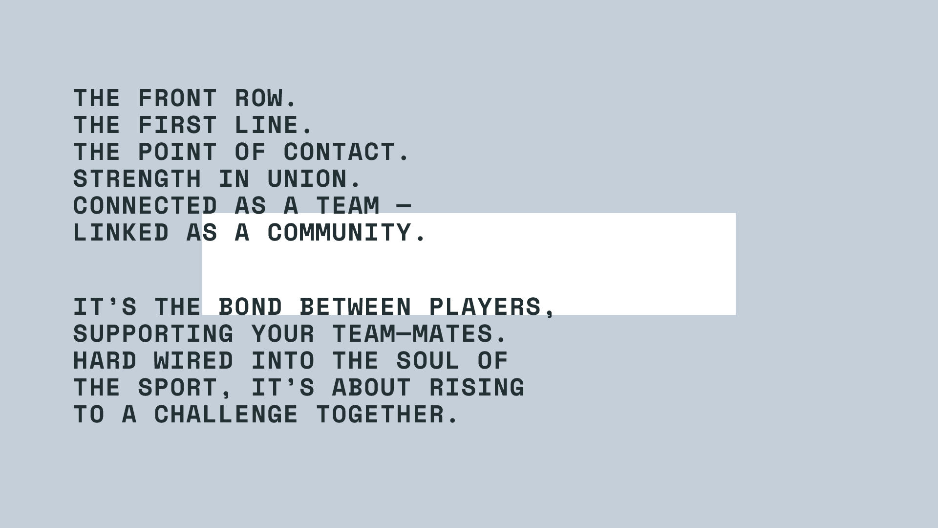
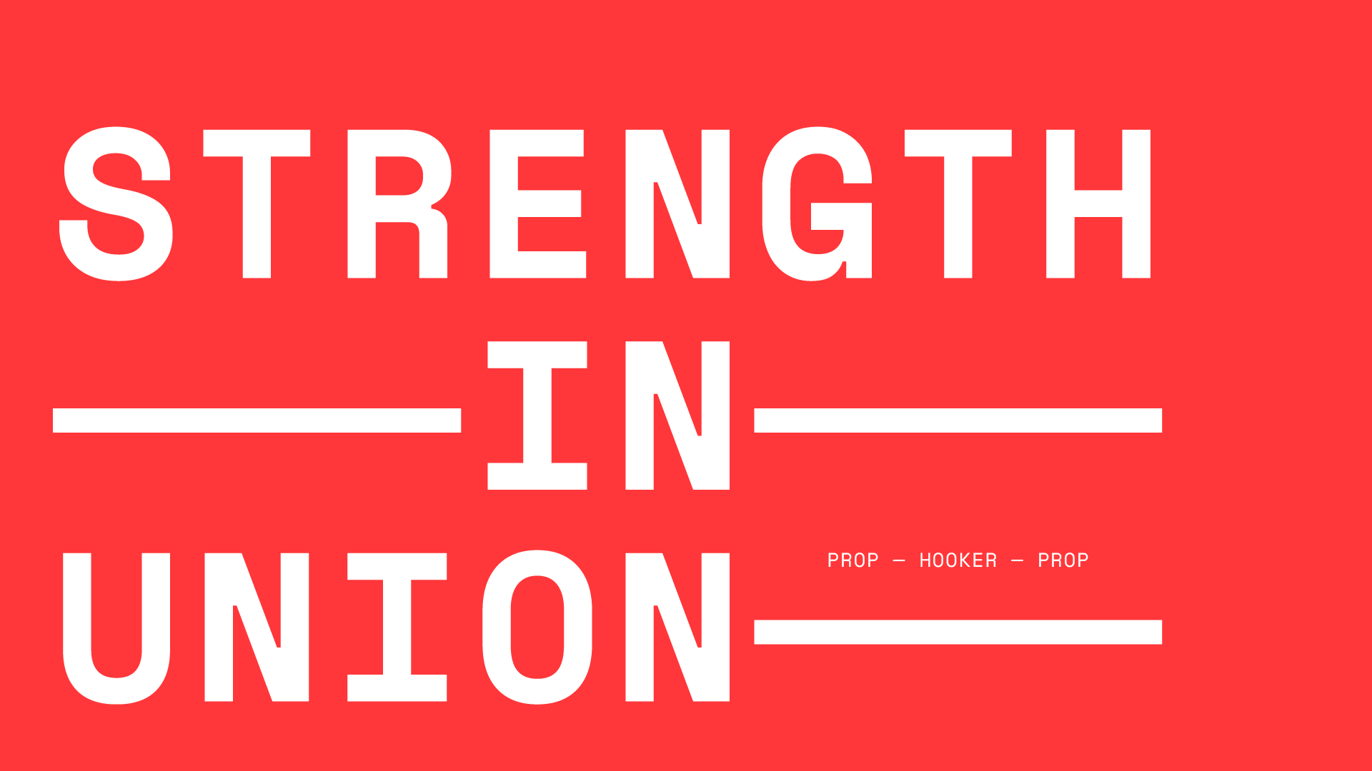
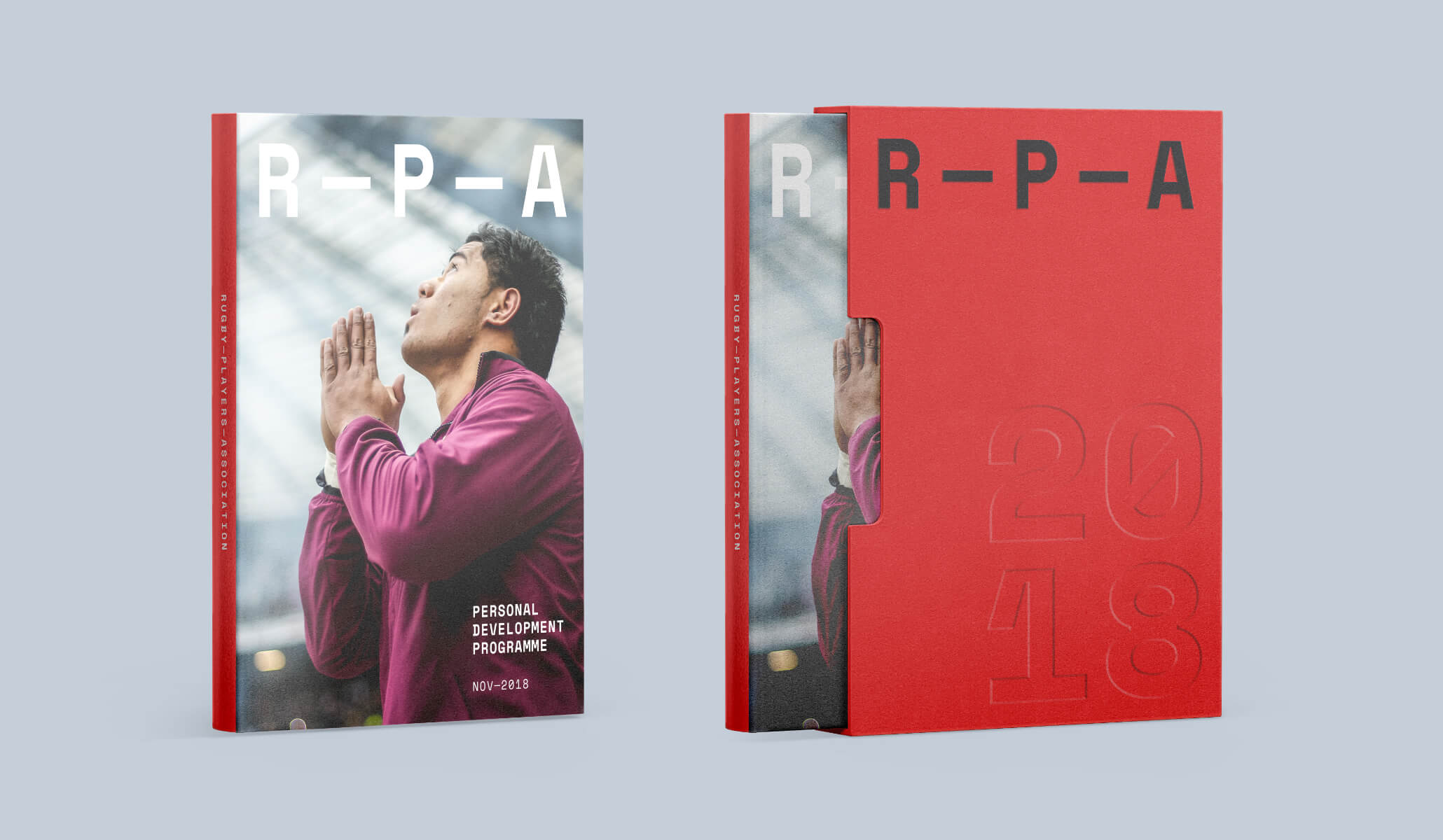
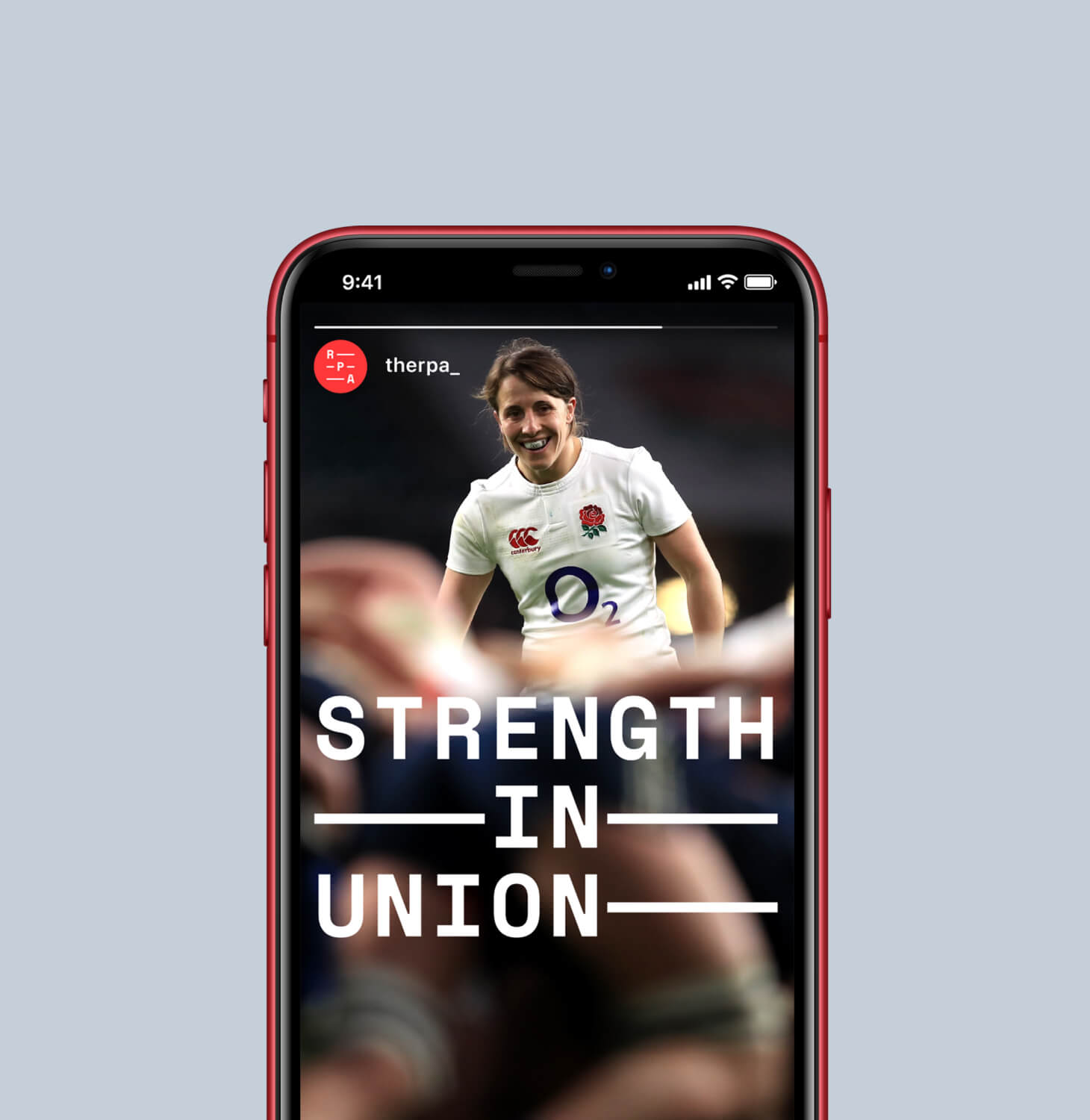
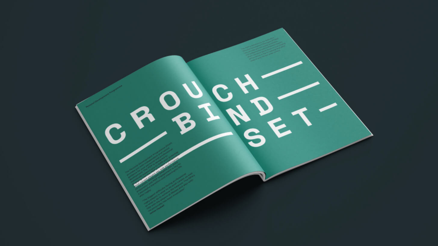
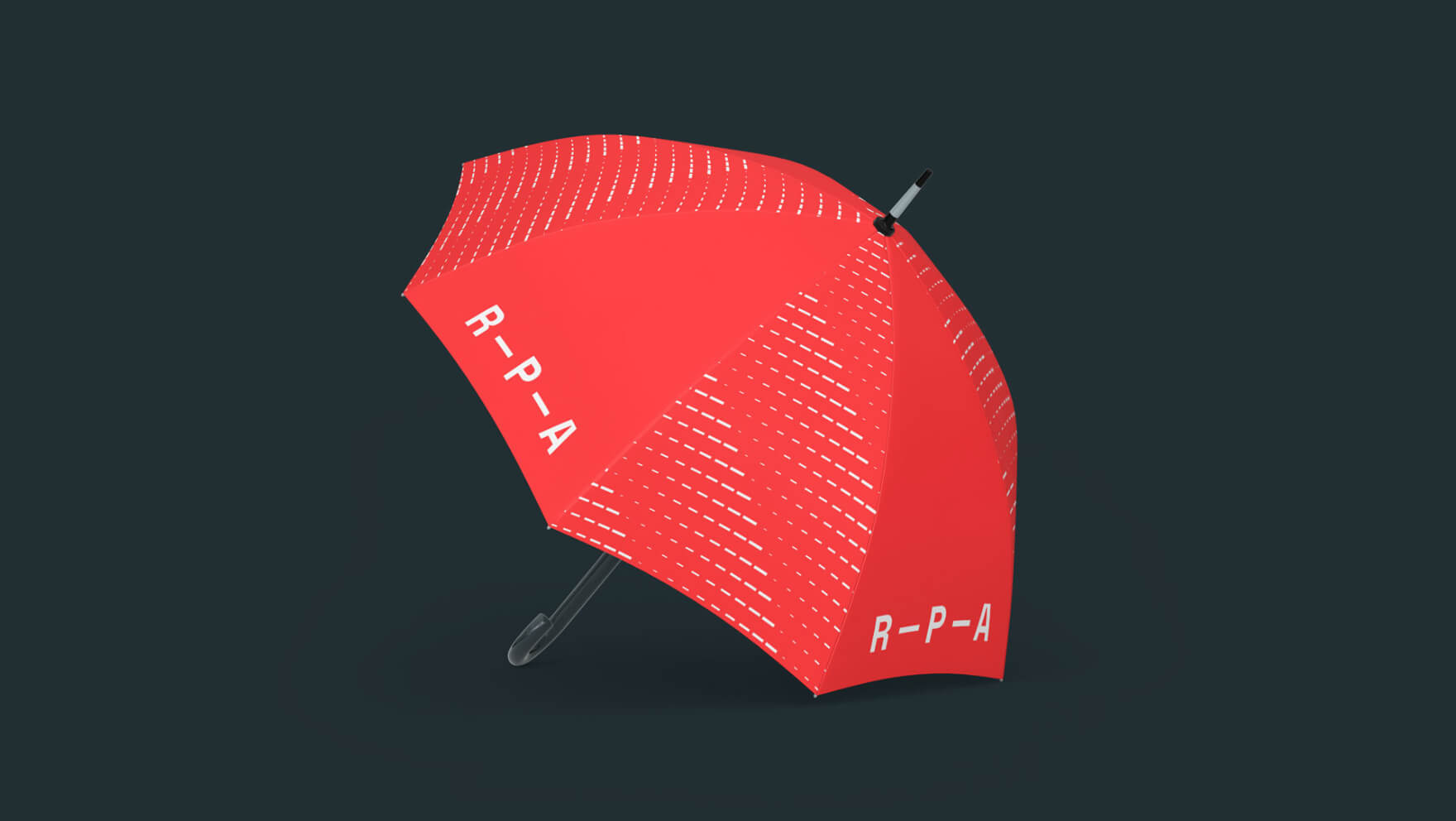
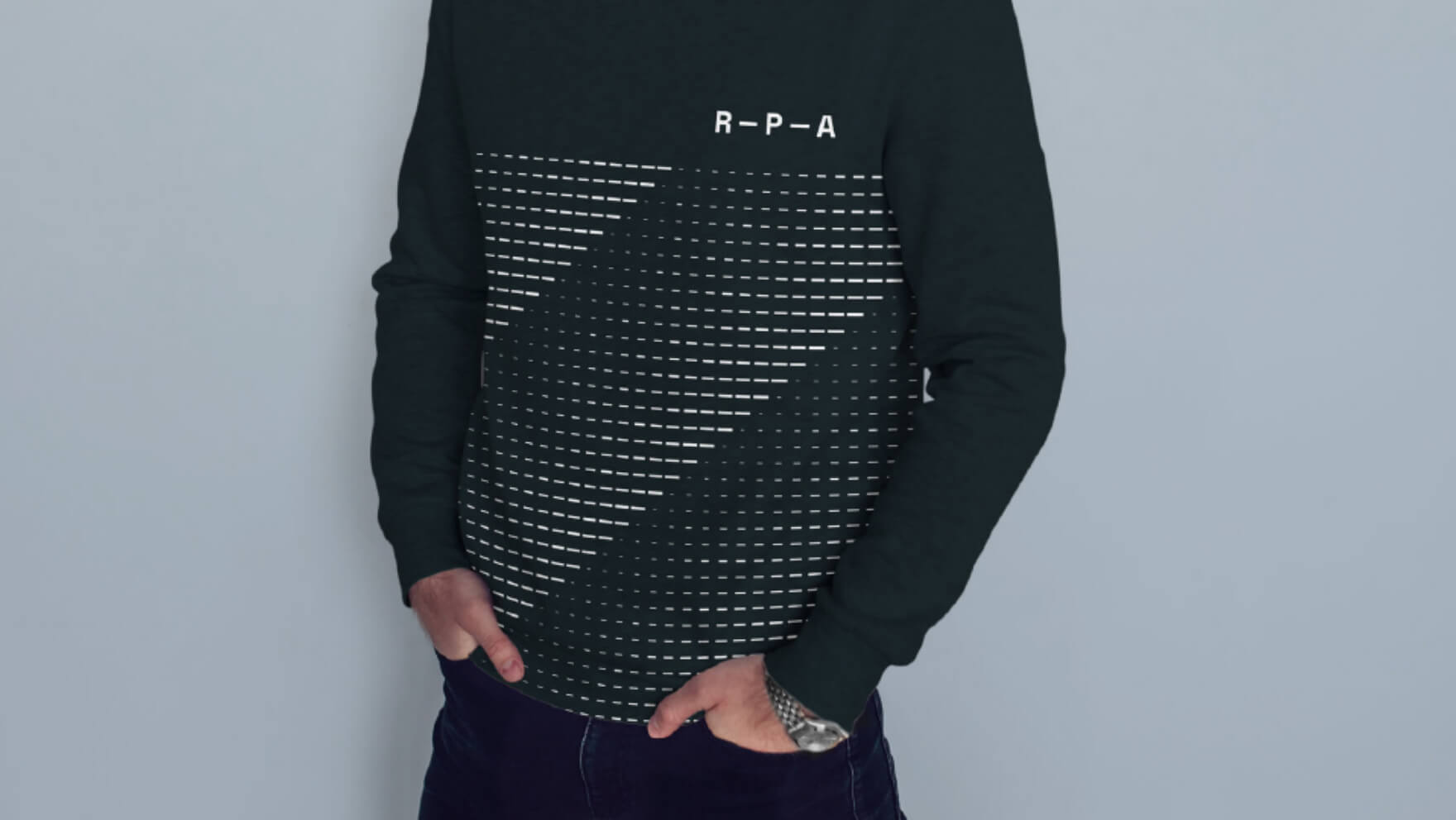
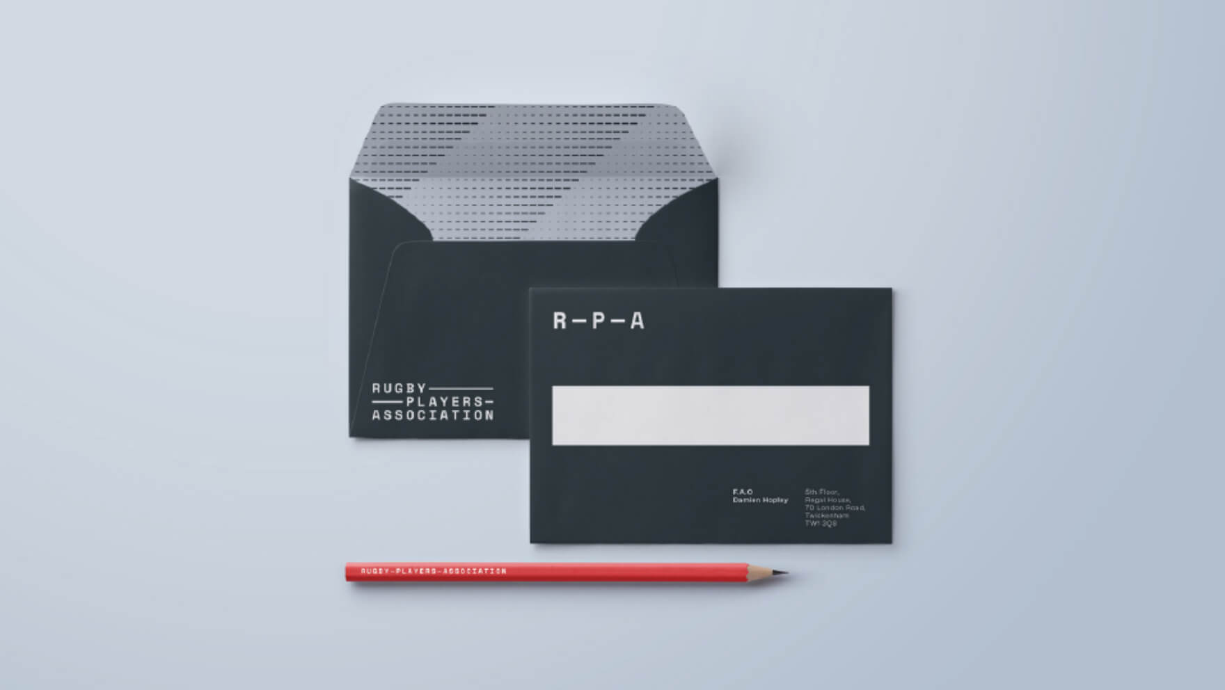
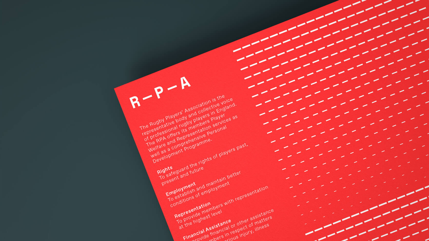
The new brand focusses on the strength and unity which is essential to rugby. It was developed following an analysis of the RPA’s brand strategy and an overhaul of the organisation’s core values and positioning. The primary logo centres on the RPA letters, linked by lines in a typographic approach reflecting the three-player front row and the tight bonds between rugby team-mates. The identity is dynamic with the symbol, wordmarks and graphic language building out from the RPA acronym. Creating an identity which is bold, no nonsense and incisive.
Disciplines
Brand architecture
Brand strategy & positioning
Brand identity
Print & packaging
Digital concepts
Editorial
Disciplines
Brand architecture
Brand strategy & positioning
Brand identity
Print & packaging
Digital concepts
Editorial
Disciplines
Brand architecture
Brand strategy & positioning
Brand identity
Print & packaging
Digital concepts
Editorial
Disciplines
Brand architecture
Brand strategy & positioning
Brand identity
Print & packaging
Digital concepts
Editorial
Disciplines
Brand architecture
Brand strategy & positioning
Brand identity
Print & packaging
Digital concepts
Editorial




hello@camerongibson.co
+44 (0) 7523 770 765
hello@camerongibson.co
+44 (0) 7523 770 765
© 2023 Cameron Gibson
© 2020 Cameron Gibson
© 2020 Cameron Gibson
© 2020 Cameron Gibson
