Champions Hockey League
Champions Hockey League
Champions Hockey League
Champions Hockey League
Champions Hockey League
The CHL is European ice hockey's premium club competition, involving 32 teams from 13 countries across Europe. To coincide with the CHL being restructured in 2016/17, the brand needed a refresh, which included new positioning, values and visual identity. The goal was to provide a fresh perspective, attract more fans and grow commercial opportunities for the CHL and its teams. Despite crowning the European champions each season, the CHL was often considered secondary to national leagues, with fans unengaged and seemingly unaware of its quality.
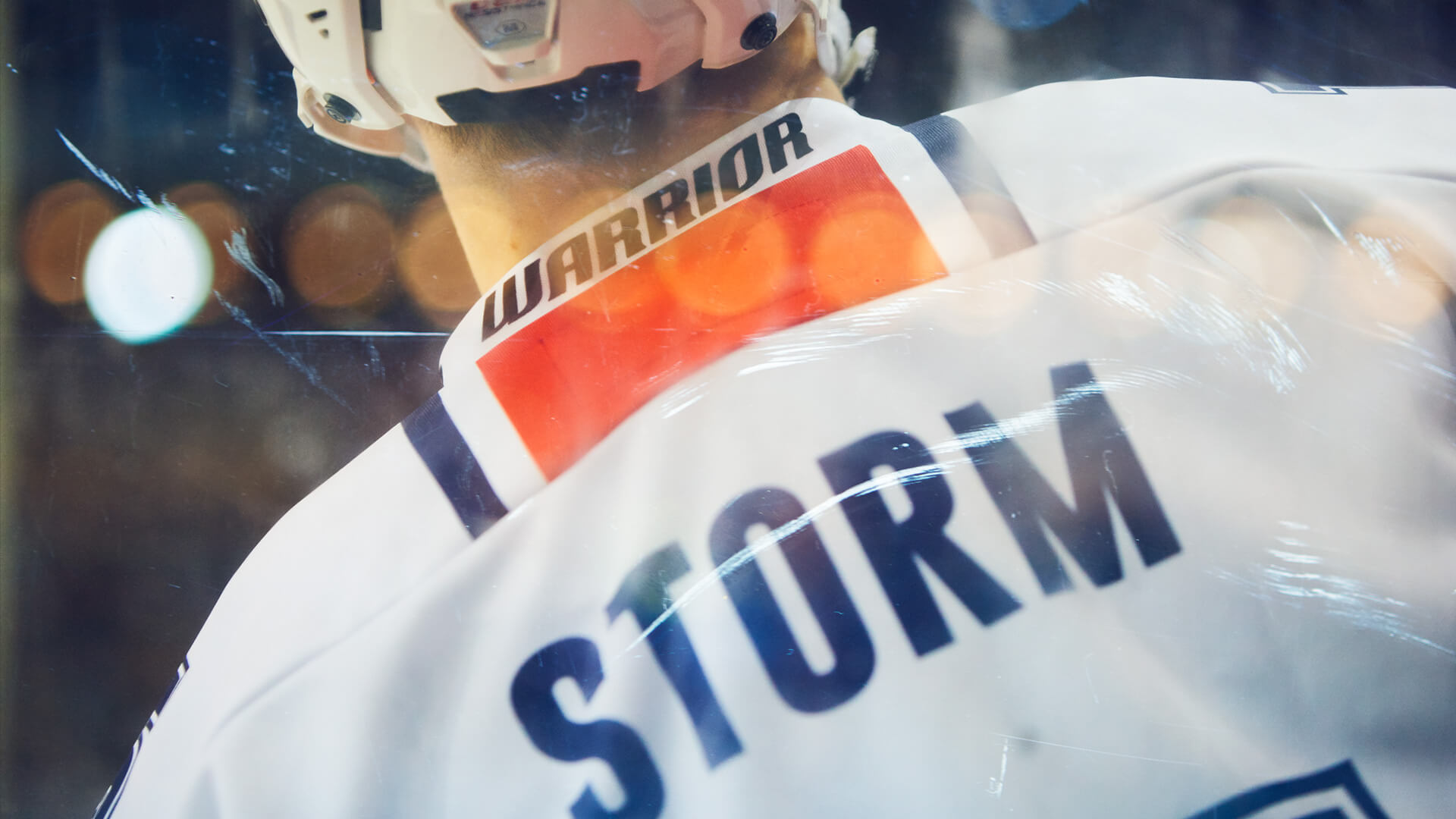
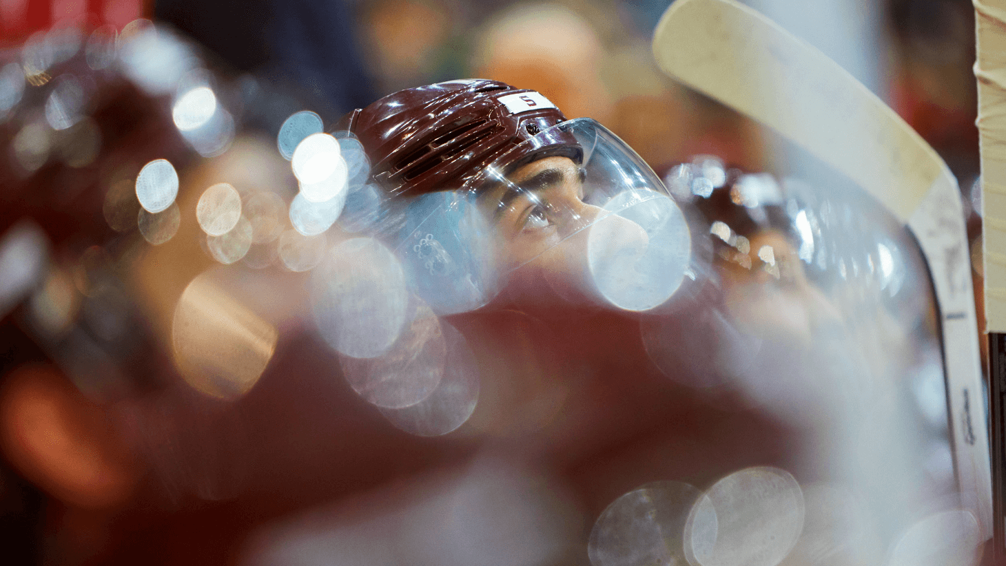
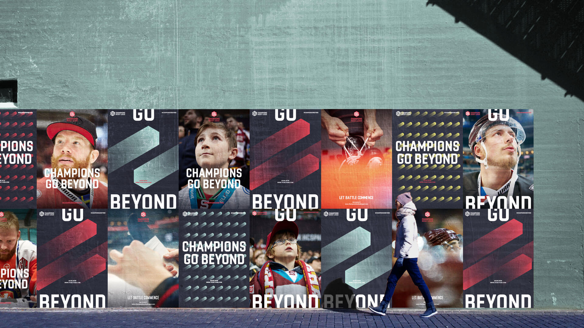
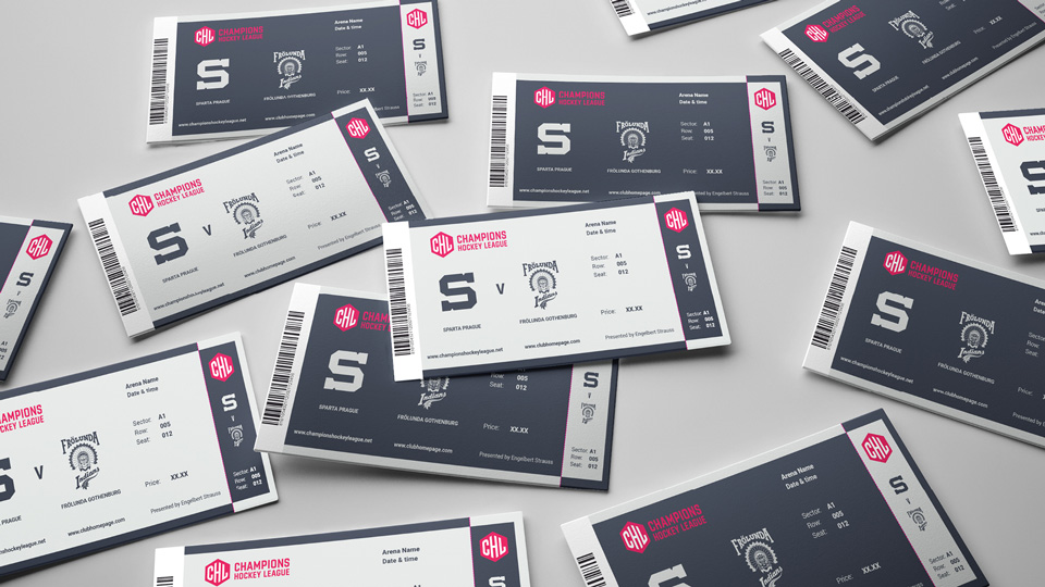
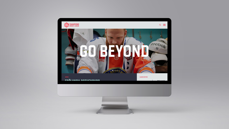
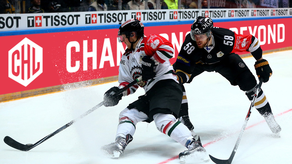
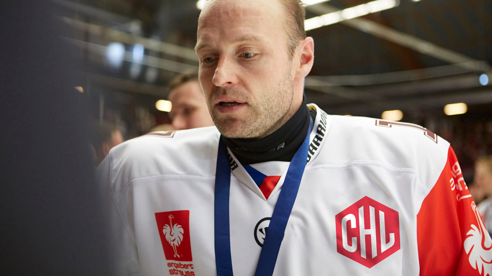
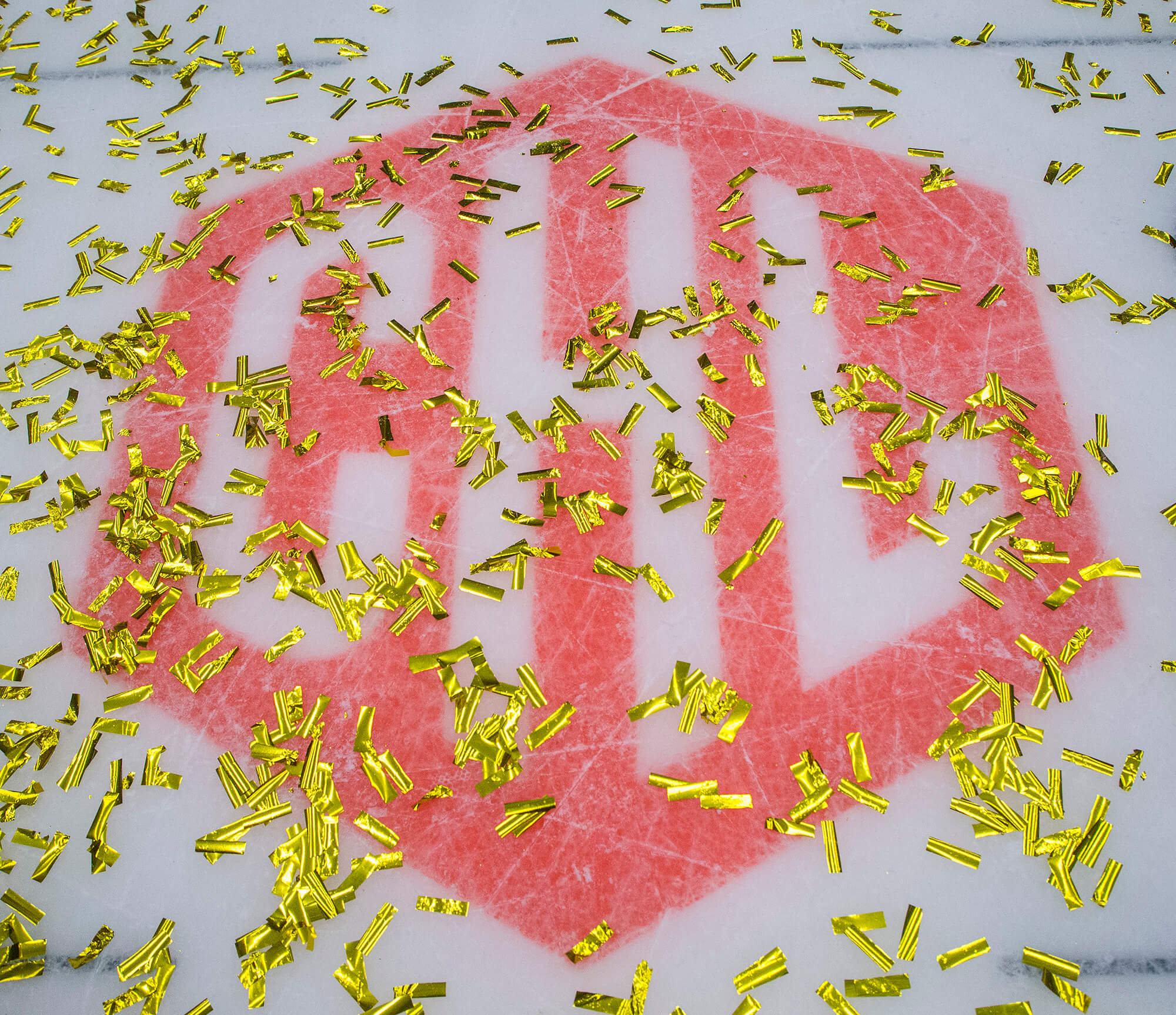
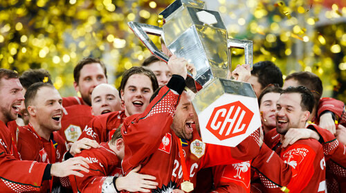
The rebrand aims to capture the movement, energy and dynamism of the game. The Slapshot is the graphic element that forms the basis of the patterns. Derived from the shape of the Champions Badge, the Slapshot symbolises the pace of the game. A customised typeface builds a strong relationship with the Champions Badge and CHL acronym. Characters subtly reference the proportions and geometry of the hockey rink. The commissioned photography aims to capture the intimacy of the rink. Getting closer, behind the scenes, up against the boards, on the ice, giving a unique perspective of the game.
The CHL is European ice hockey's premium club competition, involving 32 teams from 13 countries across Europe. To coincide with the CHL being restructured in 2016/17, the brand needed a refresh, which included new positioning, values and visual identity. The goal was to provide a fresh perspective, attract more fans and grow commercial opportunities for the CHL and its teams. Despite crowning the European champions each season, the CHL was often considered secondary to national leagues, with fans unengaged and seemingly unaware of its quality.
The rebrand aims to capture the movement, energy and dynamism of the game. The Slapshot is the graphic element that forms the basis of the patterns. Derived from the shape of the Champions Badge, the Slapshot symbolises the pace of the game. A customised typeface builds a strong relationship with the Champions Badge and CHL acronym. Characters subtly reference the proportions and geometry of the hockey rink. The commissioned photography aims to capture the intimacy of the rink. Getting closer, behind the scenes, up against the boards, on the ice, giving a unique perspective of the game.
Disciplines
Brand strategy
Brand identity
Event branding
Art Direction
Digital concepts
Disciplines
Brand strategy
Brand identity
Event branding
Art Direction
Digital concepts
Disciplines
Brand strategy
Brand identity
Event branding
Art Direction
Digital concepts
Disciplines
Brand strategy
Brand identity
Event branding
Art Direction
Digital concepts
Disciplines
Brand strategy
Brand identity
Event branding
Art Direction
Digital concepts


hello@camerongibson.co
+44 (0) 7523 770 765
hello@camerongibson.co
+44 (0) 7523 770 765
© 2023 Cameron Gibson
© 2020 Cameron Gibson
© 2020 Cameron Gibson
© 2020 Cameron Gibson